Stylify
2025 · Lead Product Designer

I research past the obvious problem and design for what I actually find
The Challenge
Design a mobile app that helps users discover clothing items they see in real life or online, find the best deals across retail and secondhand markets, and build outfits, all without the friction of using multiple disconnected tools.
The Solution
Stylify is a unified platform that addresses three critical needs: reliable visual search, comprehensive price comparison (including secondhand options), and user-directed outfit generation. By consolidating these typically fragmented experiences, Stylify helps fashion-conscious shoppers navigate economic pressures while maintaining their personal style.
Overview
I designed a unified fashion platform that solves fragmented shopping experiences
Stylify emerged from recognizing that existing tools, Google Lens, price trackers, outfit apps, force users through disconnected workflows that waste time and create frustration. My key accomplishments included:
💭
How might we help fashion-conscious shoppers discover items, find the best deals, and plan outfits without juggling multiple apps?
Understanding the Landscape
Before diving into user research, I examined the broader economic and behavioral shifts impacting how people shop for clothing.
Economic Pressures
With inflation affecting consumer spending, shoppers are more price-conscious than ever. Finding the best deal isn't just about saving money, it's about making budgets stretch further. Yet comparing prices across retailers remains tedious and time-consuming, and price drops after purchase create buyer's remorse.
Secondhand Market Growth
The resale market is booming. Platforms like Depop, Grailed, Poshmark, and eBay have normalized buying pre-owned clothing, but discovery is fragmented. Users must search each platform individually, with no unified way to compare prices between new and secondhand options or verify seller legitimacy.
Price Volatility
Online pricing fluctuates constantly. The frustration of buying an item only to see it drop in price days or weeks later is universal, yet few tools help users time purchases strategically or get notified when prices drop on saved items.
Market Research
To create a novel product, I assessed what gaps existed in the market
I analyzed existing tools to identify specific gaps in the market and understand where current solutions fall short.

Google Lens
✅ Strong image recognition
❌ No price comparison
❌ Results include scam sites
❌ Can't save or organize findings
Pinterest Lens
✅ Good for general inspiration
❌ Weak at finding exact items
❌ Broken or outdated links
Cladwell, Whering (Smart Closets)
✅ Digital wardrobe organization
❌ Limited outfit control
❌ Poor UI/UX
❌ No price discovery
ShopLook, Combyne (Outfit Builders)
✅ Fun for ideation
❌ No real-world item integration
❌ Can't shop directly from outfits
Speaking To Users
I interviewed 35 people who actively shop online and follow fashion content
Rather than assuming their pain points, I wanted to hear their stories directly. Getting perspectives from different shopping styles and budgets was important because it led me to four main discovery and purchasing problems:
The Social Media Discovery Problem
73% see items they want to buy on Instagram/TikTok weekly
89% feel uncomfortable asking "where is this from?" in comments
Why users don't comment:
"It feels desperate or thirsty"
"I don't want to seem like I'm just shopping their content"
"If I don't know them personally, it feels intrusive"
One participant told me: "I screenshot so many outfits but never do anything with them because I don't want to ask. It feels weird."
Even When Users Do Comment, They're Left Hanging
For the 11% who overcome their hesitation and actually comment, the experience is disappointing.
Only 12% receive useful responses
The reality of commenting:
65% get no response at all
23% receive vague answers like "tagged the brand!" without specifics
Only 12% get helpful information (style name, where to buy, price)
User Quotes:
"I asked where her jacket was from. She just replied with a heart emoji. Like... thanks?"
"They'll tag the brand but not say which item or collection. Then I'm searching through hundreds of products."
"I commented once and never got a response. Never doing that again."
Opportunities
I identified four core features based on user needs and market gaps
Based on the research themes and competitive analysis, I mapped these to four feature pillars focused on consolidation and user control:
📸
Multi-Source Scanning
Identify items from photos, Instagram links, or camera, no screenshots, no commenting
💰
Price Intelligence
Compare retail and secondhand prices, view price history, set drop alerts
👔
Directed Outfit Generation
Build outfits around specific items with full user control over occasion and style
Design Process
Early Concepts
Multi-Source Scanning
Research showed users discover items across different contexts, sometimes in person, often on social media. I designed three equally accessible scan methods: camera (in-person items), link paste (Instagram/TikTok URLs), and upload (camera roll images). The link paste feature specifically solves the "too shy to comment" problem, users copy post links directly without social interaction.
Price Comparison & Secondhand Integration
My initial design separated retail and secondhand prices into different tabs, but users forgot to check the secondhand option entirely. The solution: a unified price list showing all options, retail and resale, sorted by price, with trust indicators (verified badges, seller ratings, transaction counts) for every listing. A $200 retail item might have a $95 Grailed listing from a verified seller, that context changes purchase decisions.
I also added confidence scores to search results and price history graphs because testing showed users didn't trust results without transparency.
Directed Outfit Generation
Research showed outfit apps fail because they don't respect user intent. I designed a three-step process: choose an anchor item, set context (occasion + weather), then generate and refine. Users can swap individual pieces without regenerating everything, respecting partial satisfaction when "the jeans are perfect, just change the top."
The outfit builder also works with owned items OR suggested purchases, democratizing fashion creativity for users who don't own many clothes yet.
Final Designs
Scan Experience
The scan flow is the app's entry point for discovering clothing items. Users can take a photo directly through the camera interface or upload existing images from their library. Once captured, the app uses visual recognition to identify individual items in the photo, users simply draw a selection box around the item they want to identify. This streamlined process eliminates the need to crop images manually or take perfect product shots. The interface is deliberately minimal with just three controls: back navigation, capture/select, and flash toggle, keeping focus on the scanning action itself.
Outfit Builder
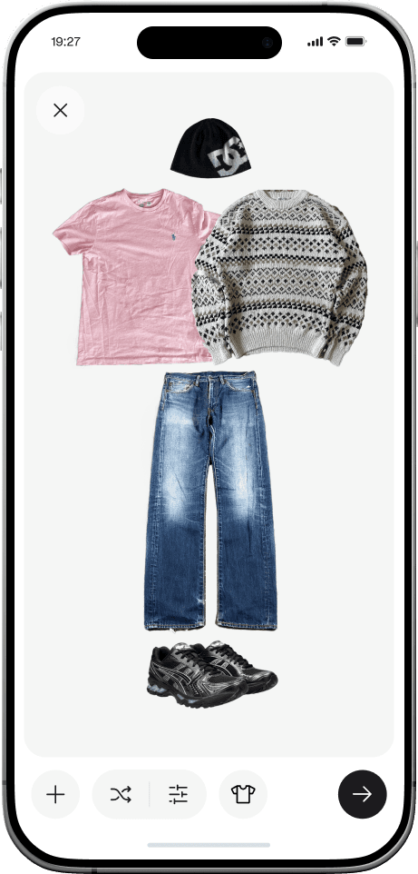
The outfit builder serves as a creative workspace where users can assemble and visualize complete looks. Users have the flexibility to either manually arrange items from their closet or let the app generate suggestions based on filters they set, such as occasion, weather, or color preferences. The builder accommodates both owned items and suggests new pieces to complete a look, making it useful for planning outfits with existing wardrobe pieces or discovering what's missing. The bottom toolbar provides quick actions for adding items, shuffling suggestions, applying filters, and changing the outfit category.


Item Detail
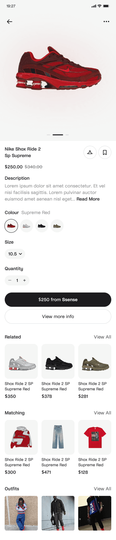
The item detail page displays comprehensive product information including current pricing, original price for comparison, color variations, and product descriptions. Users can quickly share items, save them to their closet or wishlist, and browse through available colorways. The clean product presentation keeps the focus on the item itself while providing all necessary purchase decision information in an easily scannable format. Navigation between similar items and access to price history happens directly from this screen.
Explore Feed
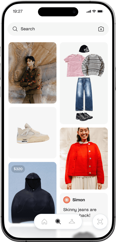
The explore page showcases outfit inspiration from the community and trending items. Users can browse through a masonry-style grid featuring both complete outfit combinations and individual statement pieces. Each post shows either user-created outfit boards or featured items with pricing when applicable. The feed mixes different content types, styled outfit flatlays, product shots, and lifestyle images, to provide diverse inspiration. Users can tap any item to view details or save entire outfits to recreate later with their own pieces.


Scheduled Outfits
The schedule view helps users plan outfits in advance, eliminating morning decision fatigue. Each scheduled entry shows the occasion, date, and countdown, with all outfit items displayed as thumbnails. If weather forecasts change significantly, the app suggests alternative outfits using weather-appropriate items from the user's closet.
What I learned
🔍 Build for real problems, not assumed ones
The most valuable insight came from discovering the two-part social media problem: users don't just feel shy about commenting, they also rarely get helpful responses when they do. This validated the need for a private discovery solution rather than trying to "fix" social interaction.
💰 Economic context shapes user needs
Designing during a time of inflation wasn't just background noise, it fundamentally changed what users needed. Price history, secondhand integration, and drop alerts weren't nice-to-haves; they were essential features that acknowledged real financial pressures.
🎯 Consolidation beats specialization
Users don't want the "best" scanner, pricer, and outfit planner separately. They want good-enough versions of all three that work together seamlessly. The value is in removing the friction between related tasks, not perfecting individual features in isolation.